
Villainous Logo Development
The logo for Villainous is definitely one of my proudest creations. While I have a strong interest in hand lettering, I am by no means a calligrapher. The logo was a bit of a challenge, but with a little work we got to what is a now, world-wide brand.
Inspiration
Disney Villainous is a wicked twist on the stories we’ve grown up loving. It was important to capture the magic of Disney but equally as important to add a touch of evil. Gothic, and black-letter fonts played into this theme nicely and was prominently featured in early Disney movies and parks.

While the classic gothic fonts felt true to the whimsy and fantasy of classic Disney, it was missing the Villainous spin. I researched modern blackletter fonts and began trying my hand at it.
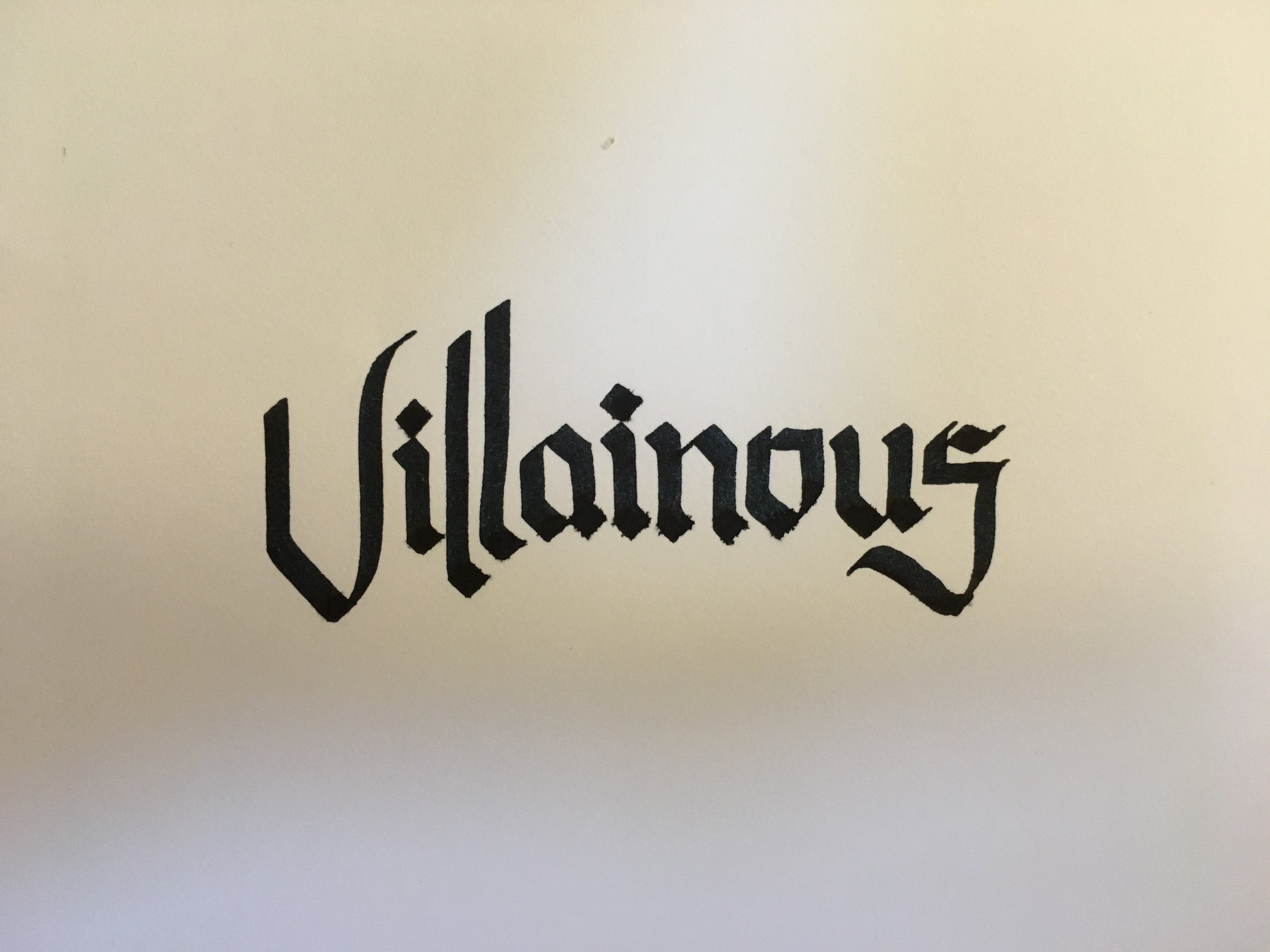
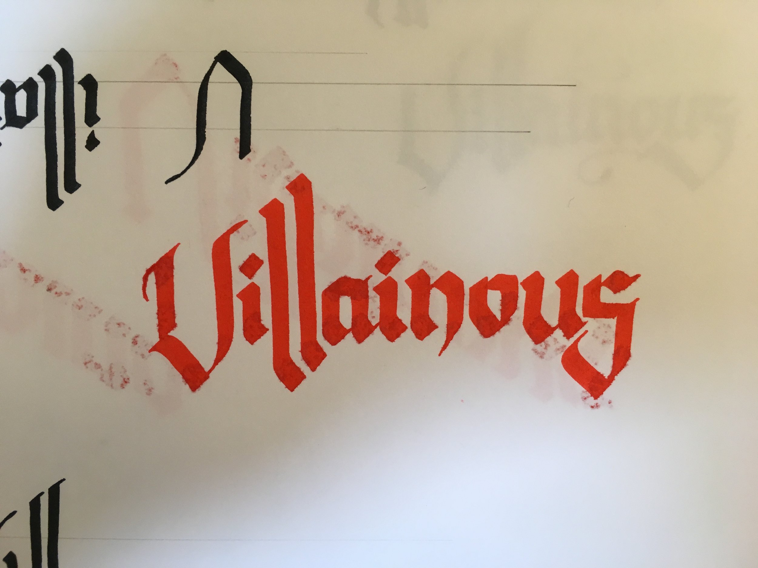
After some iteration and finally brining it to vector, we had a solid logo that felt like the dark side of a fairytale. Now all that was left was the treatment.
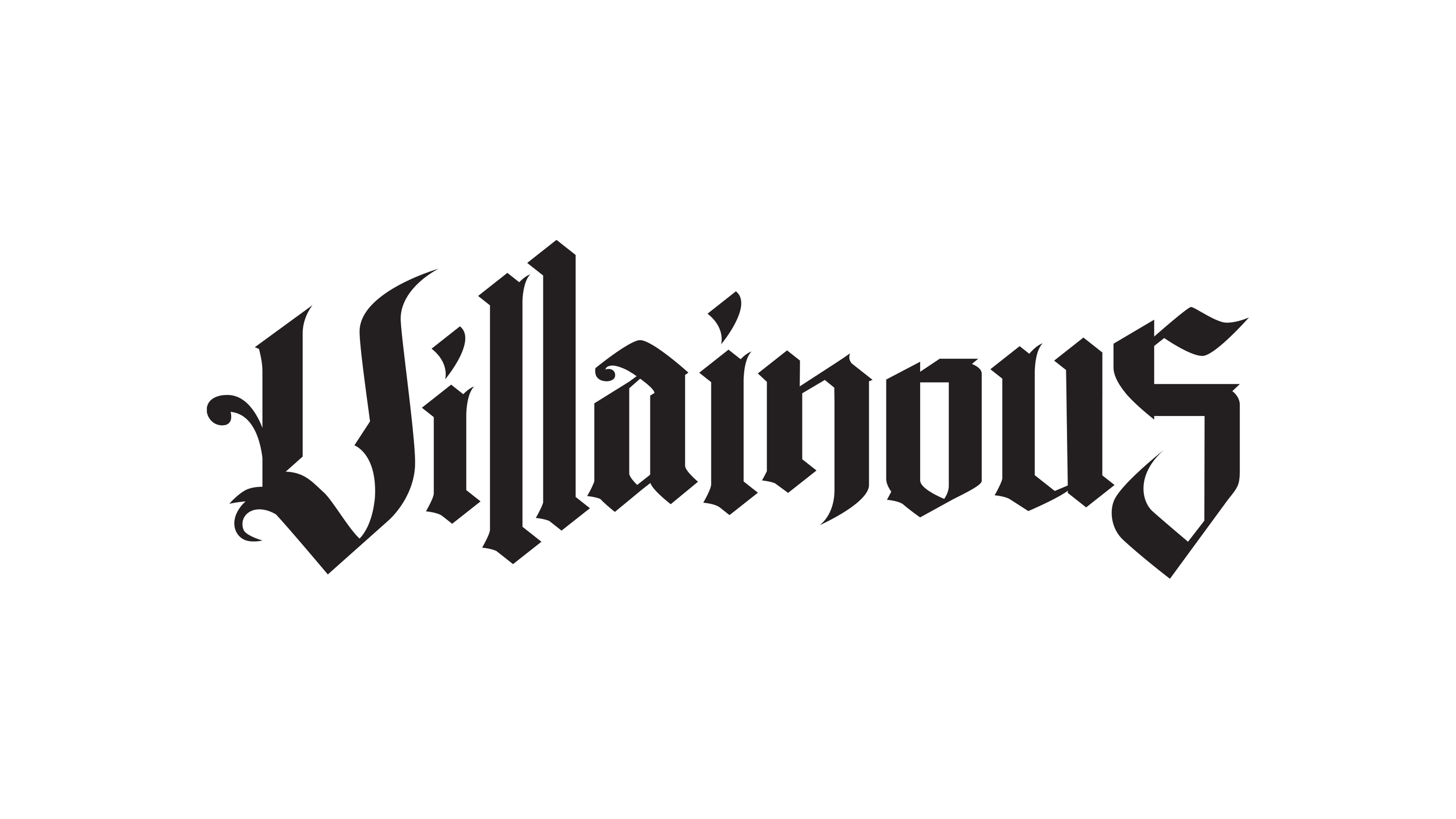
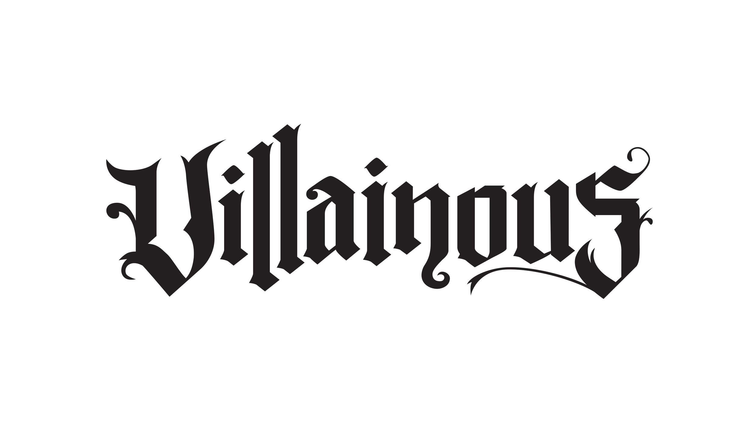
To create an ominous feeling, the logo is designed to look as if its lit from below, like a face telling ghost stories around the campfire. I added subtle textures and the slip shadow to bring the logo to life and to its final iteration.
